SAy hey ! IN THE SF MOMA
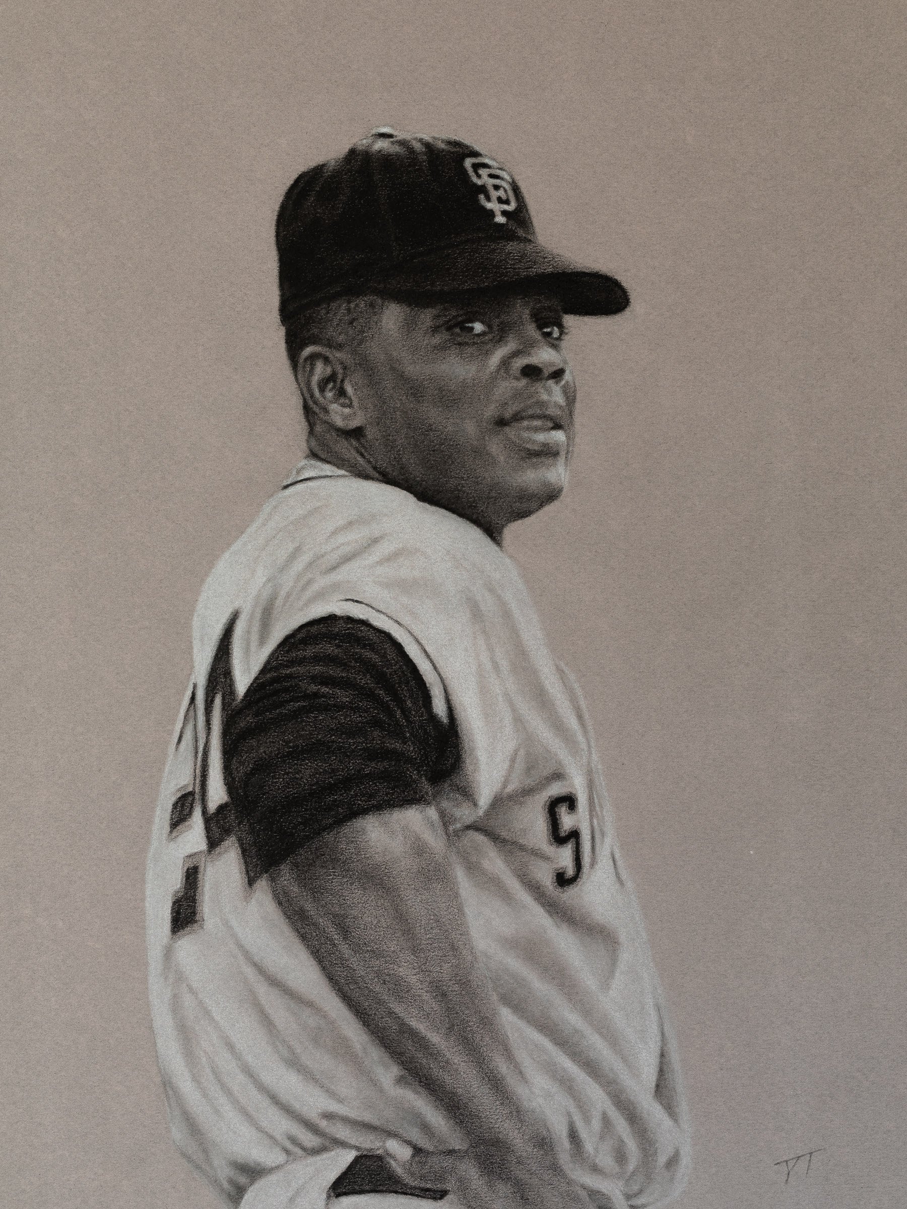
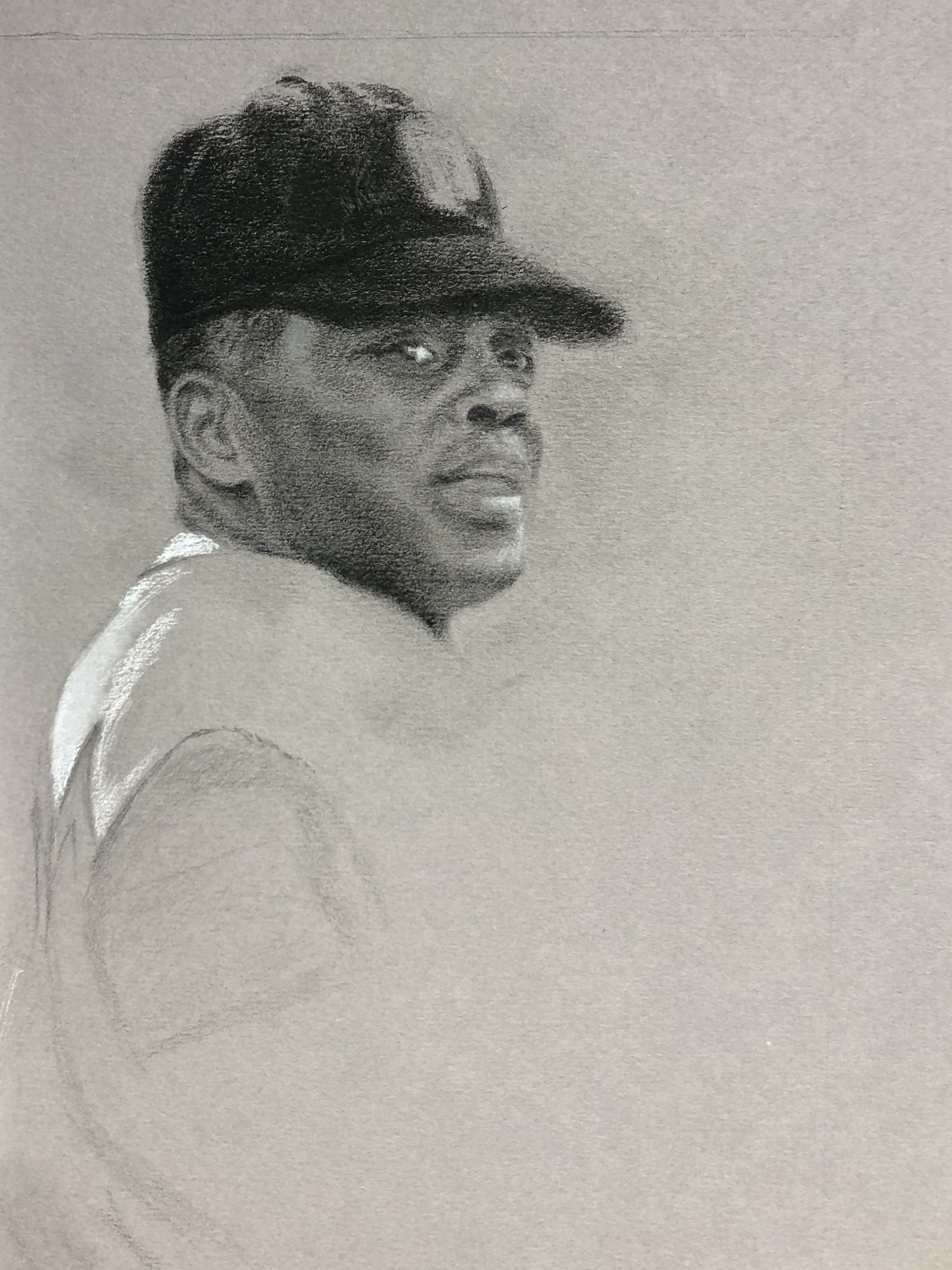
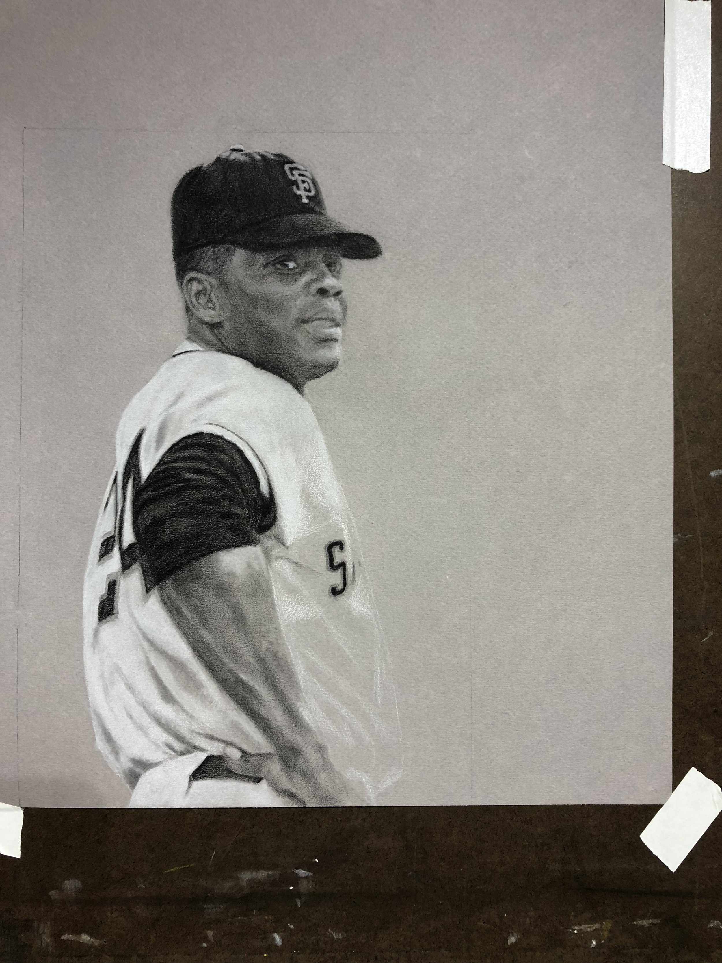
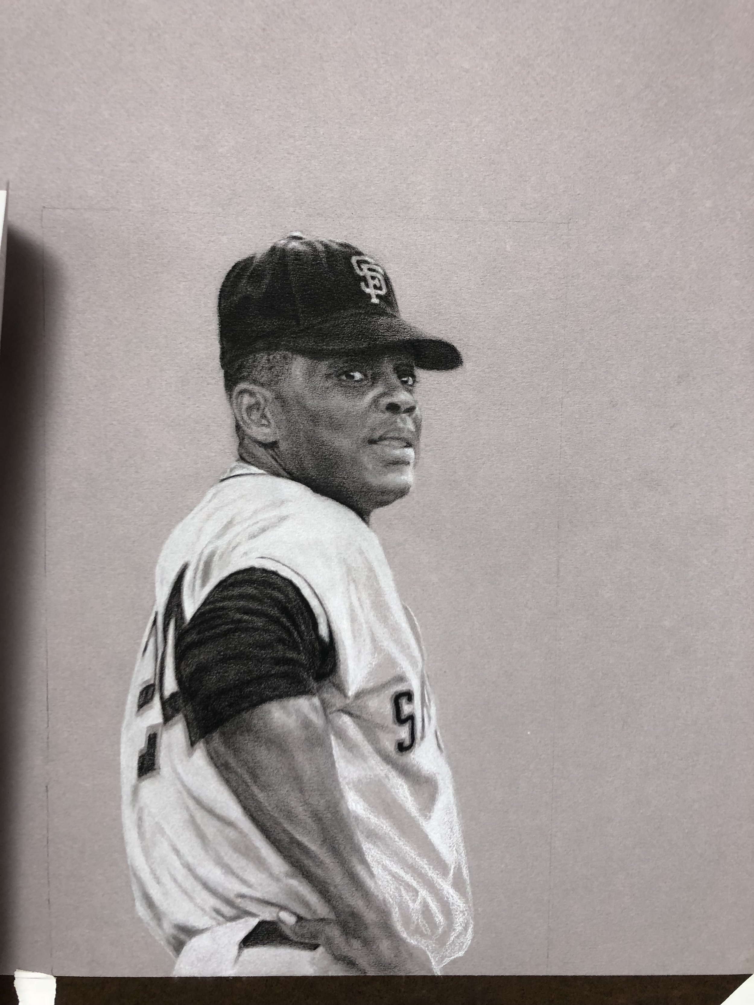
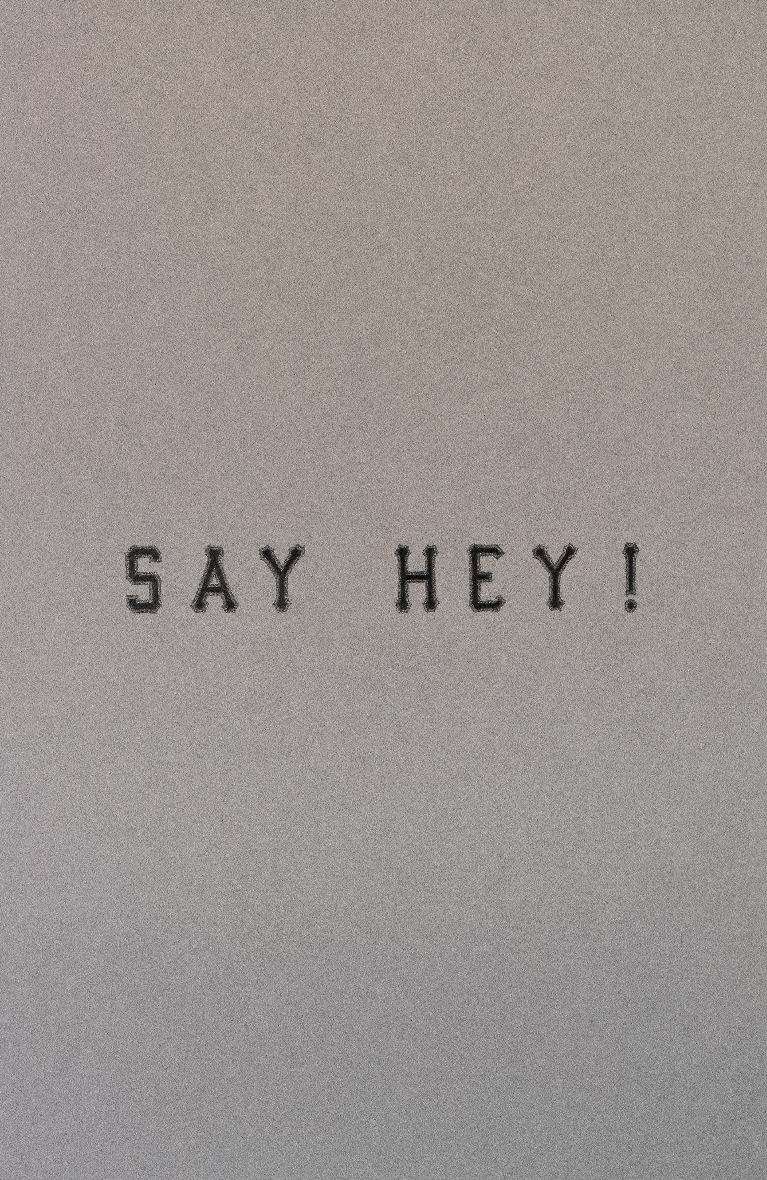
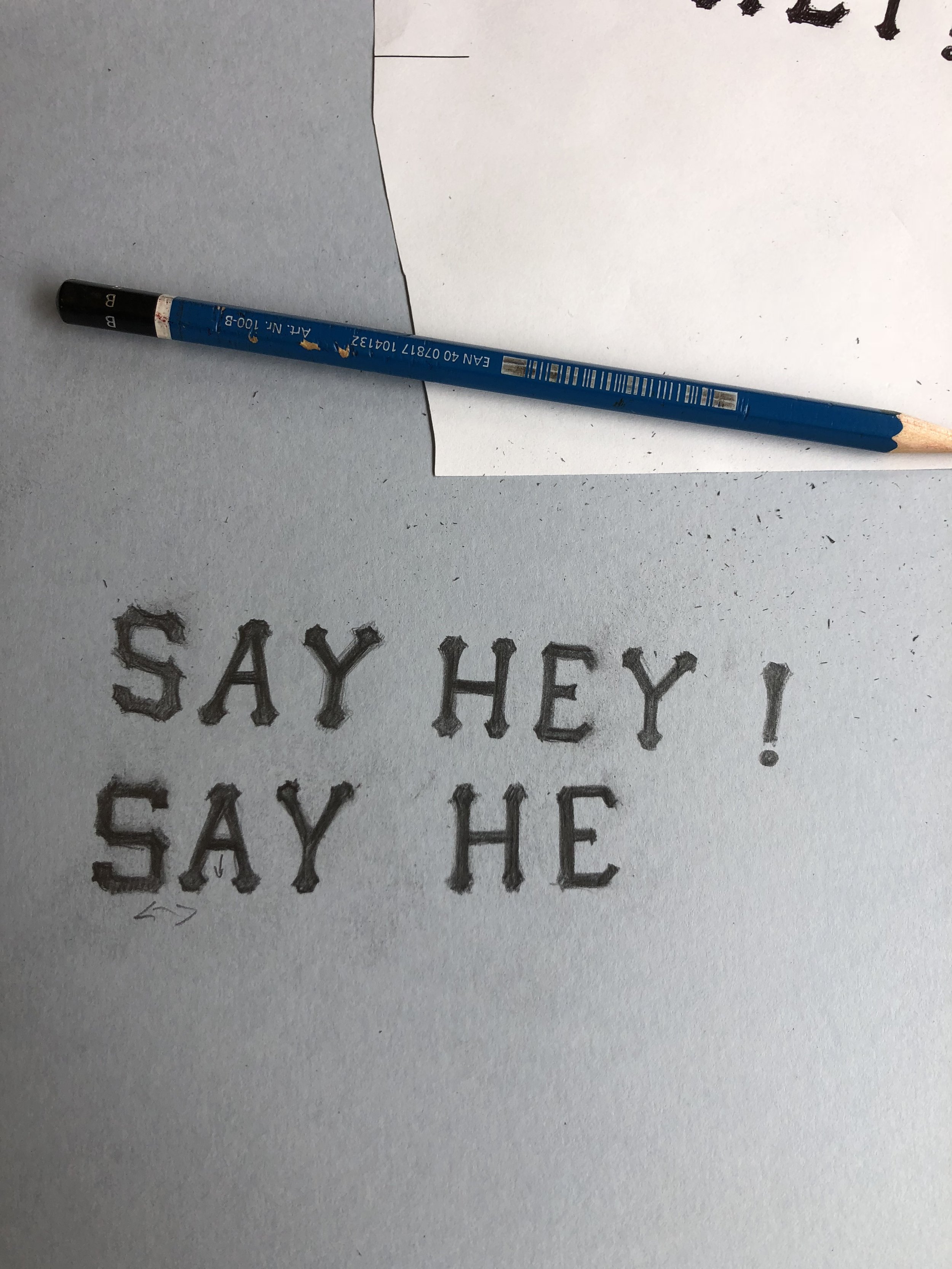
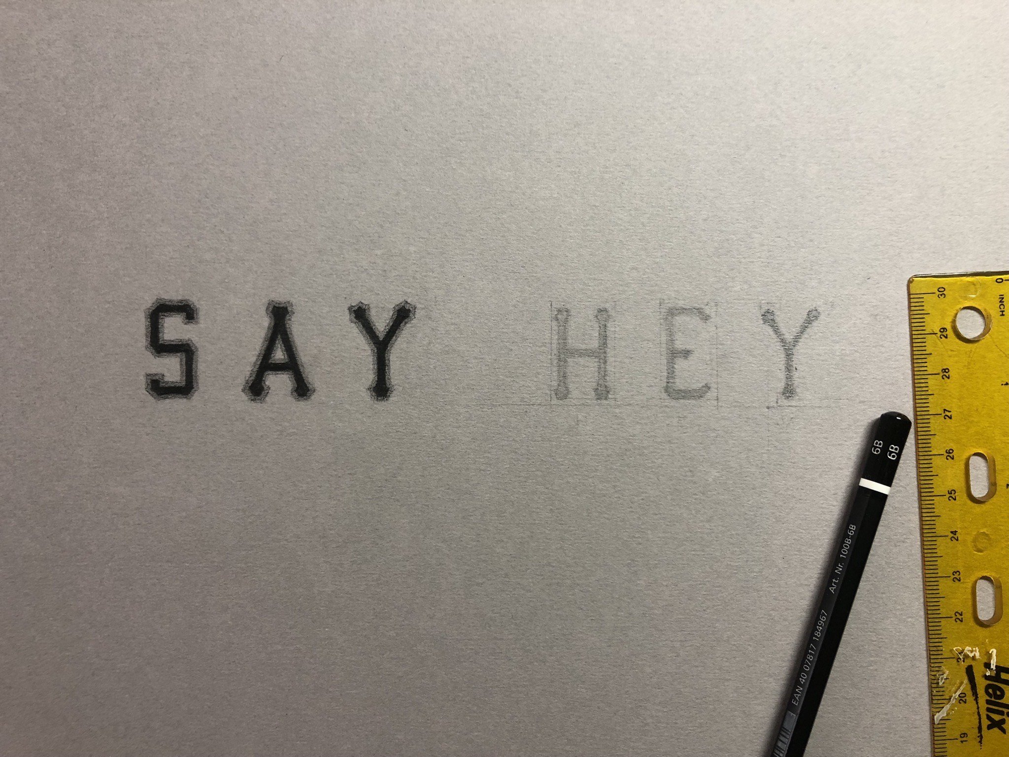
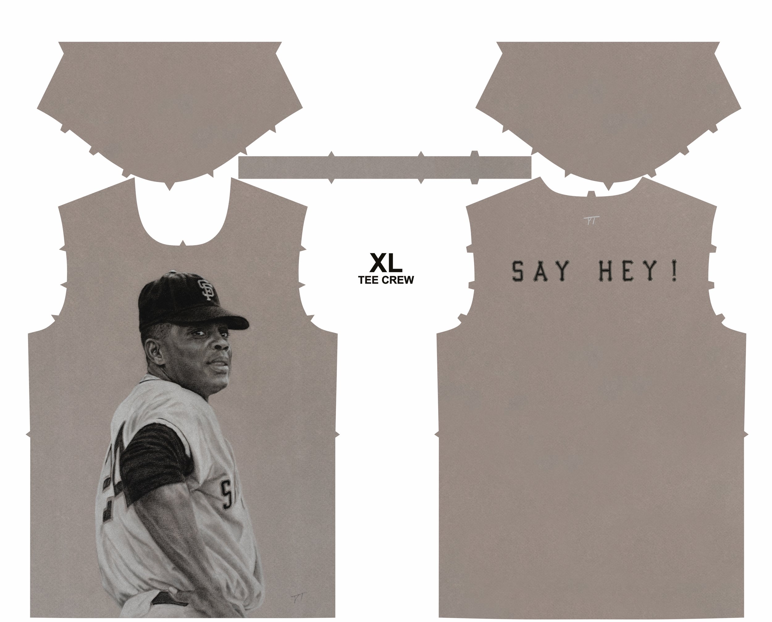
2022- After my Bob Gibson pastel, I turned to render another MLB legend, one of the greatest to ever grace the diamond, the Say Hey Kid, Willie Mays. With ideas of building a series of wearable art for the SF Giants, and after the previous labor intensive pastel drawing of Gibson, my aim here was to do something different, simple and get a polished drawing in less than a week. From a black and white slide negative I’d purchased on Ebay of Mr, Mays circa 1964, I decided it would be fun to experiment with Canson Mi Tientes toned flannel grey paper, using graphite, white charcoal and Mars Lumograph black pencils to capture the value range. The mix of the charcoal and black pencil It was a bit like olive oil and vinegar at first, but I soon got the feel could handle the mediums, embracing imperfections, I loved how the paper texture lent to a grainy vintage aesthetic. I tediously hand stenciled “Say Hey” on a separate page, following the template of the Giants uniform font from the 1960’s, with the intention of using it as the ‘wearable print’ back artwork. I’ve always taken the approach of whatever the artwork needs to best execute the concept, and this time I decided less is more, and to allow the toned paper and Willie’s larger than life gaze to fill the negative space.
update 6-18-2024: Willie Mays has passed away
update 10-9-2024: My Willie Mays drawing was selected by a juried artist to be shown in the SF MOMA Steps cafe, as part of the Fan Art: Bay Area Sports show in conjunction with the museum show, Get In the Game. The show runs through March, into April 2025.

